
今天介绍的是一套位于莫斯科的59平米的公寓,是设计师Natalya Patrusheva和Alexandra Ogorodnikova的作品。
作为设计师,经常被问起:粉色应该搭配什么颜色好看?粉色确实是一个比较不容易把控的色彩,但是这几年粉色又非常的流行,也许是它带来温暖的治愈感吧。
粉色如果要用,就要用一些中性或男性化一点的色彩去平衡,比如黑、白、灰、蓝,这个案例就是用了灰色和蓝色,让整个配色不至于过分女性化。


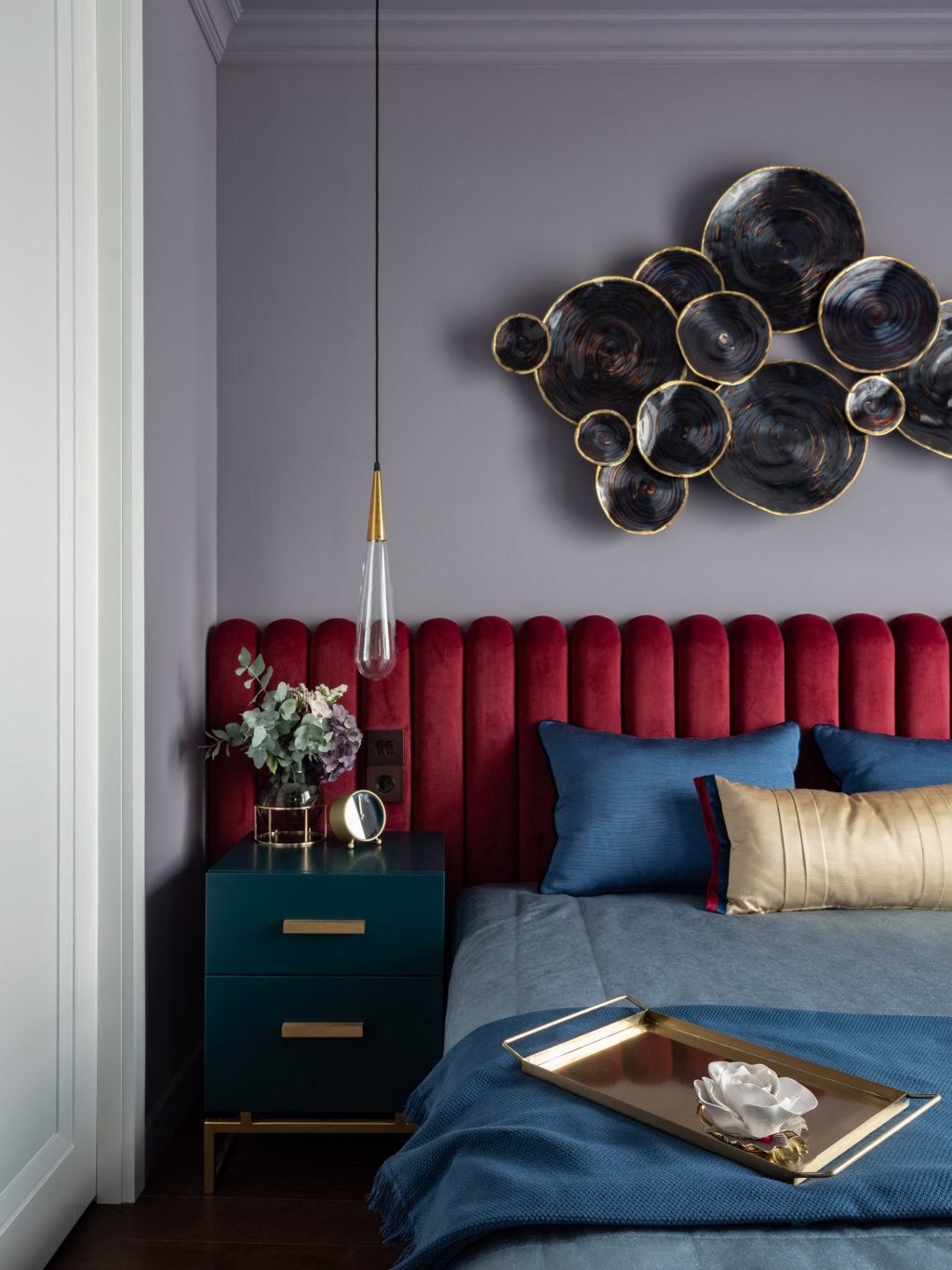
卧室整体用了一个灰调的紫色调作为背景,局部色彩的强烈对比,让视觉效果非常突出。


照片:Nick Rudenko
更多相关内容:
用最简单的方法打造美丽家园,更多的好想法请继续关注牛妞漫生活!


3 Comments
bit.ly
bookmarked!!, I really like your web site!
web hosting for
Greetings I am so delighted I found your website, I really
found you by error, while I was searching on Yahoo for something else, Anyways I am here
now and would just like to say many thanks for a tremendous post and a all
round thrilling blog (I also love the theme/design),
I don’t have time to go through it all at the minute but I have book-marked it and also
added your RSS feeds, so when I have time I will be back to
read more, Please do keep up the excellent jo.
opbest
I visited a lot of website but I believe this one holds something extra in it.
강남안마